Add Component to a Page
In Page Builder, navigate to the page you want to add the component to.
From the Components panel, drag and drop the Page Content > Brand Logo component into a container on the page.
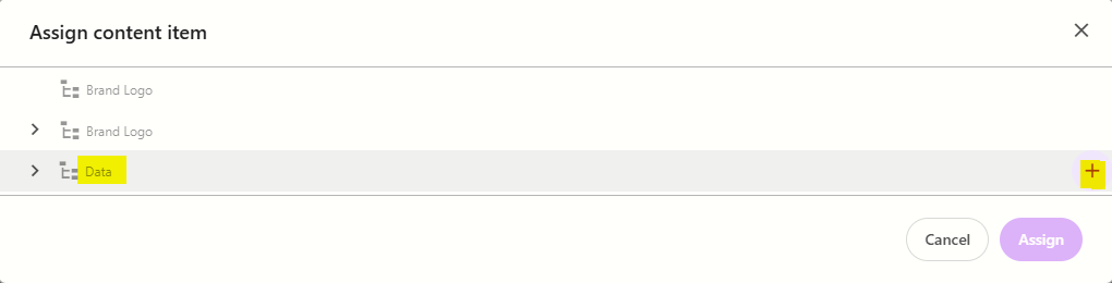
In the Assign content item window, hover over the data folder in the tree and then click on the + icon
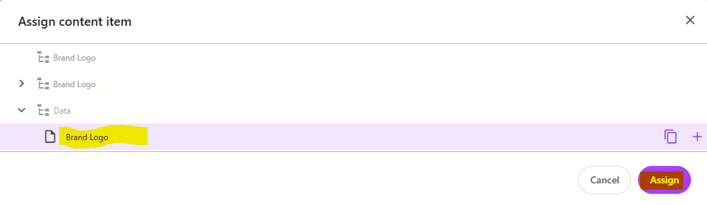
Select the BrandLogoFolder template to create a datasource, and then type the name for the new content item WITHOUT clicking on the datasource itself. Press ENTER once you have finished typing the datasource name and then click Assign.
The new datasource will appear on the page. Update the title or remove the title text if you don't want a title on the component.
To add logos to the component:
click on the component to select it and display the component configuration menu on the right
from the Design tab, expand Manage items and click + Add new > BrandLogo
Enter a name for the item and press ENTER. The page will refresh and you will see the item appear with content placeholders in it.
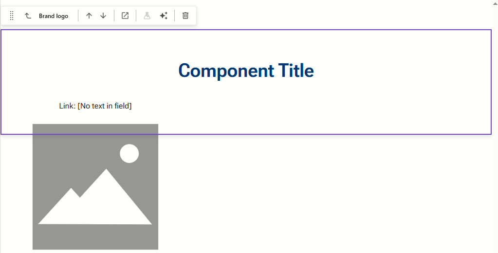
To add a link, click on the [No text in field] next to Link, and fill in the element options on the right.
To add a logo, click on the image placeholder and then select Add from the right-hand panel. Find and select (or upload) the logo you want to use from the media library
Repeat steps 6a-e for additional logos you want to add to the component.
Configure the Component
- Click on the Brand Logo component to select it and display the Brand Logo configuration options on the right
The table below outlines the configuration and advanced styling options available for the component. Apply these as appropriate.
Configuration Options | Description |
Design Tab | |
Is Contained | Tick checkbox to display the component with extra padding on the left and right; Or leave unticked to display component full screen width. |
Theme | Select a theme to change the colour of the background |
Top Spacing | Adds extra spacing above the component |
Bottom Spacing | Adds extra spacing below the component |
Content Tab | |
| Content item | Click on the pencil to open the data folder and select a different datasource |
| Heading | Displays the component heading. You can also update this directly on the component. |