Add Component to a Page
In Content Editor, navigate to the page you want to add the component to, and click on the data folder under that page to select it
Right-click on the data folder, and select Insert > Insert from template
From the Insert from Template popup window, navigate to Templates > Feature > Flatiron Dragados > PageContent > Datasource > Tab. Enter a name for the tab in the Item Name field, and then click Insert
The datasource will appear in the data folder in the content tree. In the Properties > Title field, enter a component title. Note: this is optional.
Next, add tab items to the component:
right-click on the tab datasource and select Insert > TabSection. Enter a name for the item and click OK
Fill in the Title, Image and Rich Text fields. If you want to display information as a list of key features instead of rich text:
Right-click on the TabSection and select Insert > TabSectionLegend. Enter a name for the item and click OK
Enter relevant information in the Number, Label and Distance fields. Note: if you just want to add a label, you can leave the other fields empty
Repeat steps (i) and (ii) for additional key features you want to add
Repeat steps (a) and (b) for additional tab items you want to create
Once you have created your datasource, the next step is to add the component onto the page. From the Sitecore Ribbon, select Presentation > Details
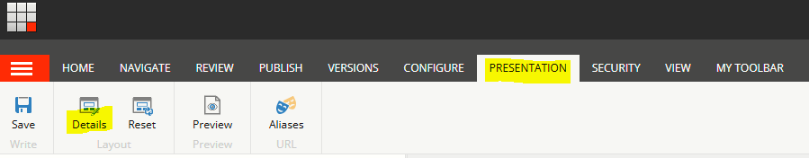
From the Layout Details popup window, select the Final Layout tab, and then click Edit under the Default section
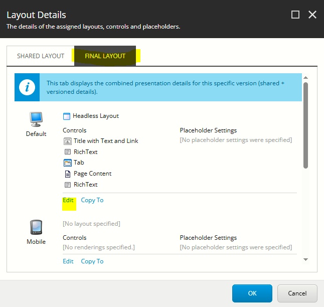
From the Device Editor popup window, select the Controls tab and click on Add
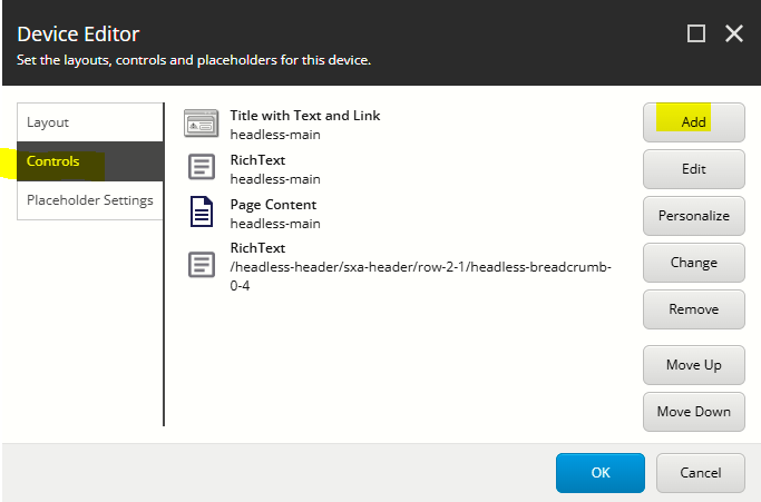
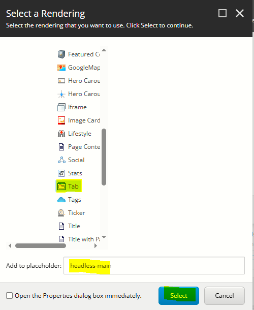
From the Select a Rendering popup window, navigate to Renderings > Feature > Flatiron Dragados > Page Content > Tab. After selecting Tab, enter the following into the Add to placeholder field: headless-main and then click Select
The new component rendering will appear at the bottom of the list in the Device Editor popup window. You can re-order it now using the Move Up and Move Down buttons, or move the component to the right spot on the page in Page Builder once you have finished adding content to it.
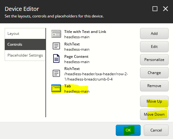
Click OK to close the Device Editor popup window, and click OK to close the Layout Details popup window
Configure the Component
- In Page Builder click on the tabs component to select it and display the tabs configuration options on the right
The table below outlines the configuration and advanced styling options available for the component. Apply these as appropriate.
Configuration Options | Description |
|---|---|
Design Tab | |
Is Contained | Tick checkbox to display the component with extra padding on the left and right; Or leave unticked to display component full screen width. |
Theme | Select a theme to change the colours of the text |
Top Spacing | Adds extra spacing above the component |
Bottom Spacing | Adds extra spacing below the component |
| Content Tab | |
| Title | Component title |
Delete Tab Section Legend
To delete a tab section legend:
- In Content Editor, click on the Tab Section Legend to select it
- Right-mouse click and select Delete
- Publish the page (Publish item with all subitems)
Delete Tab Section
To delete a tab section:
- In Content Editor, click on the Tab Section to select it
- Right-mouse click and select Delete
- Publish the page (Publish item with all subitems)
Reorder Tab Section Legend
To reorder a tab section legend:
- In Content Editor, click on the Tab Section Legend to select it
- Right-mouse click and select sorting, and use the sorting options to move the item to the correct spot
- Publish the page (Publish item with all subitems)
Reorder Tab Section
To reorder a tab section:
- In Content Editor, click on the Tab Section to select it
- Right-mouse click and select sorting, and use the sorting options to move the item to the correct spot
- Publish the page (Publish item with all subitems)