Title with Page Content
The Title with Page Content component is used to display the page title and content. It can be displayed as a full width component or a contained component.
| Working Component | Add Component to a Page | Configure Component |
Title with Page Content
Any content added to the page template itself will be displayed here. Content can also be added/edited directly within this component
Add Component to a Page
In Page Builder, navigate to the page you want to add the component to.
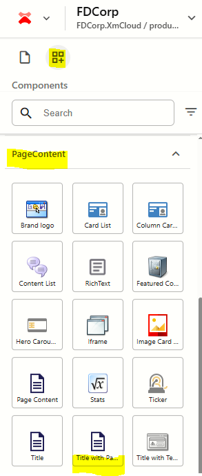
From the Components panel, drag and drop the Page Content > Title with Page Content component into a container on the page.
This component doesn't require a datasource to be created, as it uses the Title and Content fields of the page you are adding the component to. If you have already added a title and content onto the page, it will appear within the component.
Add Title and Content to the Page
- From the content tree, click on the 3 dots (...) to the right of the page name and select Page Content
- Update the following fields:
- Title: Enter the title
- Content: Enter rich text content
- As you are typing content into the fields, you will see your updates appearing on the canvas (page) within the Title with Page Content component.
Add Title and Content to the Component
- In Page Builder click on the Title field to select it. Add / update the title.
Click on the Content field to select it. Add / update the content.
Note: It doesn't matter which of the above options you select to add/edit content. Both options will update the content on the page datasource.
Configure the Component
- Click on the component to select it and display the configuration options on the right
The table below outlines the configuration and advanced styling options available for the component. Apply these as appropriate.
Configuration Options | Description |
|---|---|
Design Tab | |
| H1Title | Tick checkbox to make the card title an H1 heading style |
Is Contained | Tick checkbox to display the component with extra padding on the left and right; Or leave unticked to display component full screen width. |
Theme | Select a theme to change the colours of the text and background |
Top Spacing | Adds extra spacing above the component |
Bottom Spacing | Adds extra spacing below the component |