Add Component to a Page
In Page Builder, navigate to the page you want to add the component to.
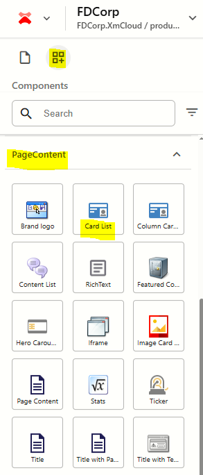
From the Components panel, drag and drop the Page Content > Card List component into a container on the page.
In the Assign content item window, hover over the data folder in the tree and then click on the + icon
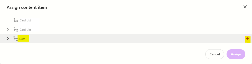
Select the Card List template to create a datasource, and then type the name for the new content item WITHOUT clicking on the datasource itself. Press ENTER once you have finished typing the datasource name and then click Assign.
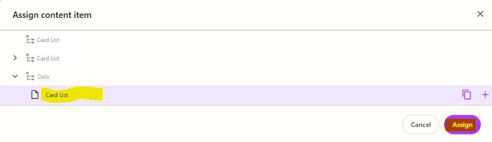
The new datasource will appear on the page. To add a card to it:
click on the component to select it and display the component configuration menu on the right
from the Design tab, expand Manage items and click + Add new > CardListItem
Enter a name for the card and press ENTER. The page will refresh and you will see the card appear with content placeholders in it.
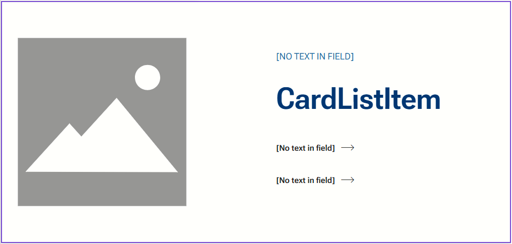
If you hover over each [No text in field] a tooltip will appear with to indicate the field name. Click on [No text in field] for the subtitle and enter a subtitle for the card if it is required.
Repeat this step for the Title [CardListItem] field.To add 1 or 2 links, click on the [No text in field] next to Link, and fill in the element options on the right.
Each card can either contain an image, or a video.
To add an image to the card, click on the image placeholder and then select Add from the right-hand panel. Find and select (or upload) the image you want to use from the media library
To add a video to the card, click on [No text in field] above the image placeholder and enter the full URL for the video. Note: the video URL is only available for the TitleDescription variant of the component.
Repeat steps 5-8 for additional cards you want to add to the component.
Configure the Component
- Click on the card list component to select it and display the card list configuration options on the right
The table below outlines the configuration and advanced styling options available for the component. Apply these as appropriate.
Configuration Options | Description |
|---|---|
Design Tab | |
| Variant | Select between Default and TitleDescription. Refer to the above working examples to see how each variant renders on the screen. |
Is Contained | Tick checkbox to display the component with extra padding on the left and right; Or leave unticked to display component full screen width. |
Theme | Select a theme to change the colours of the text |
Top Spacing | Adds extra spacing above the component |
Bottom Spacing | Adds extra spacing below the component |
| Content Tab | |
| H1Title | Tick checkbox to make the card title an H1 heading style |
| ImageRight | Tick checkbox to switch the image to the right |
| ThemeColourOnOdd | If you select a theme colour, it will be applied to every 2nd card in the card list, by default.
Tick checkbox if you only have 1 card in the card list and you want to apply a theme to it. |
Delete Cards
To delete a content item:
- Click on the Card List component on the page to select it
- From the Card List panel on the right, expand Manage items
- Hover over the card you want to delete and click on the 3 dots
- Select Delete
Publish the page (Publish item with all subitems)
Reorder Cards
To reorder content items:
- Click on the Card List component on the page to select it
- From the Card List panel on the right, expand Manage items
- Click and drag the cards into the order you want them to appear
- Publish the page (Publish item with all subitems)