Add Component to a Page
In Page Builder, navigate to the page you want to add the component to.
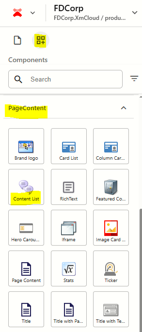
From the Components panel, drag and drop the Page Content > Content List component into a container on the page.
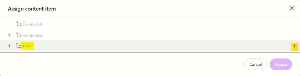
In the Assign content item window, hover over the data folder in the tree and then click on the + icon
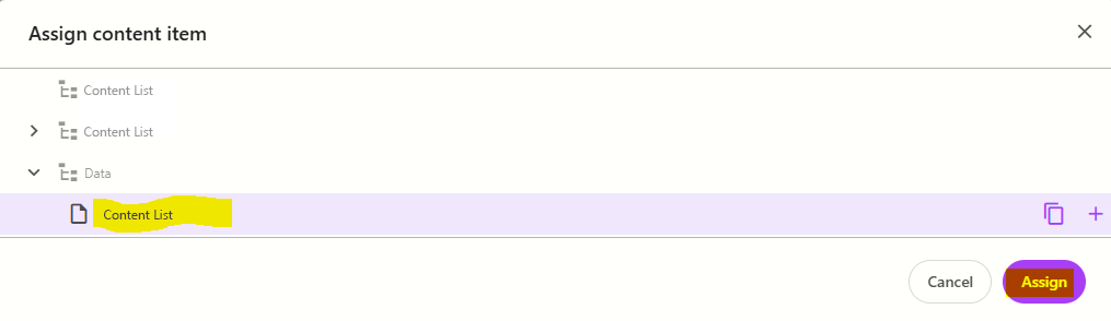
Select the Content List template to create a datasource, and then type the name for the new content item WITHOUT clicking on the datasource itself. Press ENTER once you have finished typing the datasource name and then click Assign.
The new datasource will appear on the page. Enter a title and subtitle for the component.
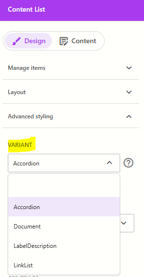
From the Advanced styling tab, select the relevant variant from the right (refer to the working component examples above.
If you are using the LabelDescription variant, you can also enter a description.
To add a content list item:
click on the component to select it and display the component configuration menu on the right
from the Design tab, expand Manage items and click + Add new > ContentListItem
Enter a name for the content item and press ENTER. The page will refresh and you will see the content item appear with content placeholders in it. Note: The content placeholders that appear will differ based on the variant selected in the previous step:
Accordion: populate the Title and Description fields
LabelDescription: populate the Title and Description fields
LinkList: populate the Link text and Path fields, and any other fields relevant to the type of link you are creating.
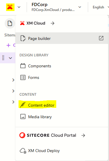
Document: Please note - you need to switch to Content Editor for this variant and populate the Download field for the Content List Item you just created. To switch to Content Editor:
Click on the XM Cloud icon on the top left of the screen and select Content Editor
Navigate through the content tree to find the Content List Item you created. i.e. Flatiron Dragados > FDCorp > Home > {Page Name} > Data > {Component Name} > {ContentListItem}.
Repeat step 6 for additional content items you want to add to the component.
Configure the Component
- Click on the content list component to select it and display the content list configuration options on the right
The table below outlines the configuration and advanced styling options available for the component. Apply these as appropriate.
Configuration Options | Description |
|---|---|
Design Tab | |
| Variant | Select between Accordion, LabelDescription, Document and LinkList. Refer to the above working examples to see how each variant renders on the screen. |
Is Contained | Tick checkbox to display the component with extra padding on the left and right; Or leave unticked to display component full screen width. |
Theme | Select a theme to change the colours of the text and background |
Top Spacing | Adds extra spacing above the component |
Bottom Spacing | Adds extra spacing below the component |
| Content Tab | |
| Title | Component title |
| Subtitle | Component subtitle |
| Description | Component description - only gets displayed on the LabelDescription variant |
Delete Content Items
To delete a content item:
- Click on the Content List component on the page to select it
- From the Content List panel on the right, expand Manage items
- Hover over the item you want to delete and click on the 3 dots
- Select Delete
Publish the page (Publish item with all subitems)
Reorder Content Items
To reorder content items:
- Click on the Content List component on the page to select it
- From the Content List panel on the right, expand Manage items
- Click and drag the content items into the order you want them to appear
- Publish the page (Publish item with all subitems)