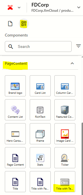
Add Component to a Page
In Page Builder, navigate to the page you want to add the component to.
From the Components panel, drag and drop the Page Content > Title with Text and Link component into a container on the page.
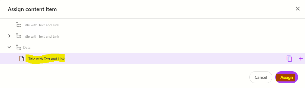
In the Assign content item window, hover over the data folder in the tree and then click on the + icon
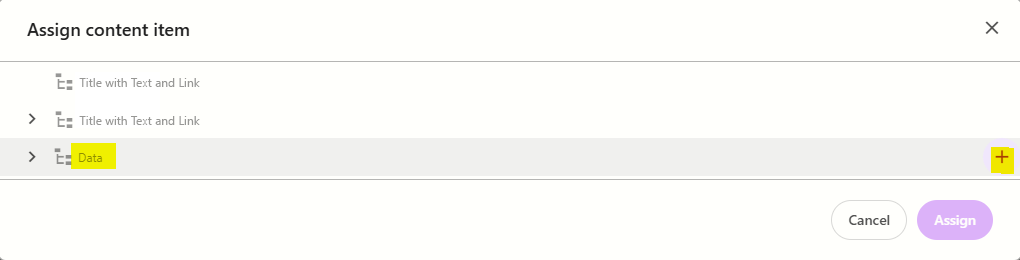
Select the Title and Text Link template to create a datasource, and then type the name for the new content item WITHOUT clicking on the datasource itself. Press ENTER once you have finished typing the datasource name and then click Assign.
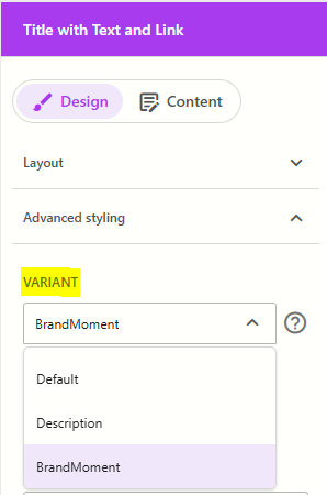
The new datasource will appear on the page. Select the relevant variant from the right (refer to the working component examples above.
Populate the relevant fields for your selected rendering variant
Default: populate the Title, Subtitle, Description and 2x Link fields
Description: populate the Description field
BrandMoment: populate the Title and Description fields
Configure the Component
- Click on the Title with Text Link component to select it and display the component configuration options on the right
The table below outlines the configuration and advanced styling options available for the component. Apply these as appropriate.
Configuration Options | Description |
|---|---|
Design Tab | |
| Variant | Select between Default and Description and BrandMoment. Refer to the above working examples to see how each variant renders on the screen. |
| Make title H1 | Applicable for the Default variant only. Tick checkbox to make the title field an H1. Only use this option if the component is placed at the top of the page and you want the title to be the main heading on the page. |
Is Contained | Tick checkbox to display the component with extra padding on the left and right; Or leave unticked to display component full screen width. |
Theme | Select a theme to change the colours of the text and background |
Top Spacing | Adds extra spacing above the component |
Bottom Spacing | Adds extra spacing below the component |
| Content Tab | |
| Subtitle | Component subtitle |
| Title | Component title |
| Description | Component description |
| Link1 / Link 2 | Select the icon that matches the link type you want to create
|
| Link text | Link label for Link 1 / Link 2 |
| Link tooltip | Label that appears when hovering over Link 1 / Link 2 |
| Applicable when creating an email link. Enter an email address for Link 1 / Link 2 | |
| Path / URL | Internal or external URL for Link 1 / Link 2 |
| Open in a new window | Tick checkbox to open Link 1 / Link 2 in a new window |
| Link 1 Type / Link 2 Type | Choose between:
|